EMAIL360 is a cloud-based software that delivers the most powerful features of marketing automation solutions at a fraction of their cost. EMAIL360 helps marketers start the conversation with their website visitors by collecting the barest minimum contact information. By doing so with a 1-click form and without complex reCAPTCHAs and page transitions, EMAIL360 provides a frictionless experience, boosting conversion of visitors to leads in the process. Many high-tech marketers, media websites, etailers and others that have implemented EMAIL360 have seen 2-3X uplift in website leads compared to lead forms published on their contact us pages. Click here, here and here for a few success stories of EMAIL360.
However, if you want to collect more information than the visitor’s name and email, you might want to use a longer online form. Before you go ahead with publishing such a form on your website, be aware of the following downsides of your action:
- Your visitors will have to leave their current page to navigate to the CONTACT US page of your website, which is where they’re accustomed to finding online forms. There’s no guarantee that they’ll return to the content that got them to your website in the first place.
- In case you need different specialists to respond to leads for different products and services showcased on your website, you’ll need to manually route your incoming lead forms to the appropriate person in your organization. This could increase your operating costs and lead to delays and leakages in handling your website leads.
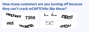
- Your form will need a reCAPTCHA or equivalent to keep away spam. Problem is, codes like these tend to confuse website visitors, many of whom might bounce off your website in frustration. Because reCAPTCHA is an ongoing project, cracking them will only get tougher with time. Have a look at the following reCAPTCHAs and judge for yourselves whether we’re overstating this problem.
Due to the above factors, long registration forms cause friction and lead to website abandonment. Some studies put abandonment rate as high as 90%, but even if it’s only 50%, it means that half your SEO, SEM and social media marketing investments go down the drain. Per contra, by using a solution like EMAIL360, you can double the bang for your demand generation buck.
However, for whatever reason, if the additional contact information is simply indispensable for your specific situation, go ahead with a long form. But try to pre-fill as many fields in it as possible, based on what you already know about the website visitor. For example, take a visitor who lands on your website by clicking a hyperlink on a promotional email sent by your company for a certain offering. The very fact that the visitor has received your email means that s/he has signed up for it – we’ll assume that you don’t engage in spamming – so you probably know her name, company, title, and so on. Instead of presenting a blank form and exasperating the visitor, you can delight her by pre-filling these fields. Ask the visitor to only enter any remaining information such as a question that’s highly specific to the showcased offering (“Do you plan to buy social media monitoring software in the next 12 months?”) and is, therefore, unlikely to have been included in your generic sign-up form.
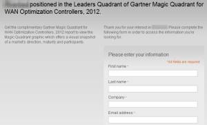
While this seems obvious, we rarely come across companies who follow this practice. All we see are blank forms day-in-day-out, such as the one shown below from a company that has our business card from when we attended one of its events last year.

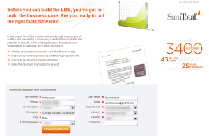
Against this backdrop, SumTotal Systems’ recent email offering a whitepaper was a refreshing change. When we clicked on the download button given on the email, we were pleasantly surprised to see a form that was pre-filled with all our contact information. We were able to download the whitepaper with a single click. That’s a great example of a frictionless solution.

We won’t be surprised if @SumTotalSystems saw a spike in response and conversion rates for this campaign. By following its example, you can too!
