Usability is generally associated with benefits like reduced friction, superior UX and greater cross-selling for e-commerce providers. Click here to read a couple of my articles and blog posts about usability in this context.
During a recent transaction, I realized how better usability could also cut costs for an online business.
 I normally buy domain names from the leading registrar GoDaddy. From time to time, I receive coupons from GoDaddy for 15-30% discounts. Since I normally order one or two domain names for one year duration at a time, my orders seldom surpass the $40-80 floor values required to qualify for these discounts. As a result, I’ve generally been ignoring these coupons.
Recently, when I wanted to buy a domain name for five years, I noticed that it cost $60.85. I was delighted to get the chance (finally!) to use a GoDaddy coupon. Taking advantage of the huge – now unlimited – storage provided by Yahoo! email, I never delete these GoDaddy coupons even if I’ve been unable to use them. Sure enough, when I searched my archive folder, I was able to locate a recent coupon from GoDaddy that offered 30% off on a minimum order value of $60. I plucked out the discount code from GoDaddy’s email and entered it on the checkout form of the GoDaddy website. However, after applying the coupon, I got a cryptic message saying “The promo code you entered is invalid, expired, or ineligible for the items you are purchasing.”
Well, since my order value exceeded $60, I couldn’t figure out why GoDaddy was rejecting my code. Clicking the View Offer Limitations link didn’t help much.
I was about to abandon my shopping cart at this stage. Not that 30% savings on $60 was substantial in absolute terms. My decision was driven more by getting ticked off at not being able to avail myself of GoDaddy’s discount the first time I qualified for it in all these years. On a higher level, I probably felt betrayed by GoDaddy after years of being loyal to it. Whatever.
Given my state of mind at the time, I’d have quit the website – and, who knows, GoDaddy itself forever – except that I happened to notice a 24/7 Sales & Support telephone # displayed prominently on the top of its checkout page. Since I anyway had an unlimited Skype calling plan for the USA, I decided to don my headphone and make the call.
The Customer Service Representative who came on the line immediately “got” me. There was none of the usual duh-like response that one gets from many call centers these days. Apparently, my order value of $60.85 included a $1-odd fees payable to ICANN. Since my net order value fell below the $60 qualifying limit, the website had rejected my discount code.
Now, domainers are aware that ICANN, or the Internet Corporation for Assigned Names and Numbers, is the private sector, non-profit corporation created to assume responsibility for coordinating domain names across the hundreds of for-profit domain registrars like GoDaddy. Therefore, fees payable by GoDaddy and other registrars to ICANN are tantamount to taxes, duties and levies. Like anyone reasonable, I’d no problem in accepting GoDaddy’s policy of netting out ICANN fees from its order value.

Where do usability and cost reduction figure in all this?
Simple.
If only its website had explained its policy clearly, GoDaddy could’ve saved money on providing higher cost telephone support. If displaying multiple charges makes things confusing for an average GoDaddy customer, fair enough. The website could show this breakup at least when the order value is close to the eligible floor limit for the entered discount code, like mine was.
For those wondering if there’s any business case in making the necessary enhancements to the website to deliver superior usability in this narrow context, let me do some back-of-the-envelope calculations below and see what conclusions we can draw from them:
- The telephone call took around 15 minutes
- The CSR was definitely not located in some low cost call center
- 15 minutes of a high-quality CSR’s time can cost more than the $$ figure deal size.
Since not every GoDaddy customer is likely to have an unlimited Skype calling plan, they wouldn’t have made the call unlike me, and GoDaddy would’ve lost the deal, if not a loyal customer forever (Note to complacent vendors: I moved a large portfolio of domain names from another registrar to GoDaddy a couple of years ago, so I won’t hesitate to move it once again if it comes to it.)
To come to the conclusion of the story, GoDaddy’s CSR immediately came up with the suggestion of upping my order to six years. For this longer duration, the order value crossed $60 net of ICANN fees and therefore qualified for the 30% discount. Faced with one quote for 5 years @ $60.85 and another for 6 years @ $55, no prizes for guessing what I did, so the story had a happy ending.

I’m sure that even with the best of design and programming inputs, it’d be impossible for a website to match a human CSR’s ability to come up with a winning alternative proposal interactively and in realtime. So, I’m excluding the concluding part of the telephone interaction from the purview of website usability. (Although it’s probably within the realm of capabilities of virtual agents, but that’s a topic for another day). Having said that, the earlier part of the process flow on the website could’ve always been designed in such a way that the website doesn’t have to face such an impossible situation in the first place.
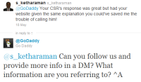
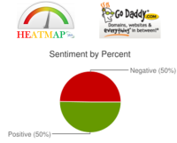
GoDaddy immediately followed up this telephone conversation with a customer satisfaction survey email where it asked two simple, but highly relevant, questions. Once I gave the above feedback on this survey, I decided to take up GoDaddy’s suggestion to tweet my views – just to see where it went. @GoDaddy tweeted me back almost immediately asking for more information. Credit where it’s due, I haven’t come across such quick response when I’ve tweeted my feedback to a lot of other companies. According to its HEATMAP360, GoDaddy has a 50:50 sentiment on Twitter, so it has the opportunity to improve its service so that its positive sentiment improves even further.