A couple of years ago, we’d created a marketable item around Web 2.0 technologies that was targeted at banks. At the time, we’d inferred a growing interest in online shopping for financial products when an increasing number of Gen Y / Millennials began to ask, “If I can buy a book, CD or, even a car, online, why should I visit a branch to open a checking account?”
Given this background, I was very excited when I recently read that a leading bank in Australia launched a new Internet Banking portal that was inspired by online shopping portals. This seemed to be just what our marketable item was urging banks to do and, for the first time in our knowledge, a bank seemed to be publicly acknowledging the superior functionality offered by the Amazons of the world.
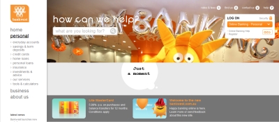
When I checked out the bank’s new website, I found it to be full of images bearing the trademark transparent colors of Web 2.0, which is increasingly becoming the hallmark of most e-commerce portals.


However, when I scratched the surface, I was perplexed to see a page full of forms to be do be downloaded and snail-mailed to the given address. Yes, that’s right, snail-mailed. Clicking the APPLY button against checking account took me to an online form that I had to complete and submit, then wait for someone to contact me in 24-72 hours. For credit cards, although I found a COMPARE feature that is customary with high-end e-commerce portals, I couldn’t spot any APPLY button.

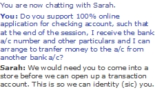
A quick chat session with a customer service representative confirmed that the bank’s portal did not support online issuance of any product. Apparently, the bank needs the potential customer to visit a “store” – that’s branch for you and me – in order to verify the applicant’s identity and address. The portal didn’t seem to be using any online identity or address verification web services that have been available in Australia for at least the past two years.
Let alone online shopping portals, this bank hasn’t even drawn sufficient inspiration from its own competitors in the local banking market, at least one of which offers end-to-end online account opening functionality on its next-generation website. (Since there seems to be some confusion around the term ‘online account opening’ , let me clarify: You go to the website, select a checking account product you like, submit the required information, get your account # if your application is approved, transfer funds from another account to this new one if you like – all in a single session and in under a couple of minutes.)
It’s high time banks realized that UX is much more than eye candy. It involves, among others, frictionless solutions that let users fulfill their goals of visiting a website as seamlessly as possible.