Top 6 US banks posted a trillion dollars in profits in the last 10 years.
"Top 6 Banks In USA Earn $1 Trillion In Profits In Last 10 Years" ~ https://t.co/coy2mSvu3C via @maxabelson @business .
That's the same period when fintech was supposed to disrupt dinosaur banks. #Disruption #Shisruption #Banking #FinServ pic.twitter.com/kjZfCkqSbC— Ketharaman Swaminathan (@s_ketharaman) December 27, 2022
Compared to that, I wonder if the Top 6 fintechs in USA have received even one trillion pageviews during this period.
Therefore, there’s no doubt that banks are way ahead of Fintechs in terms of revenues, profits and customer counts.
To that extent, the expression “catch up” in the title and overall context of this blog post refers solely to the wide gulf in the User Experience of websites, mobile apps, wearable apps and other consumer-facing software from banks versus fintechs (collectively “apps”).
Before I take a deep dive into the central theme of this post, let me distinguish between banks and fintechs by providing the following working definitions for these entities.
Bank: A traditional company that has a banking license and offers bank account, fixed deposit, credit card, personal loan, payments and other financial services products. Acquires and owns the customer relationship. Examples: Barclays, Citi, HDFC Bank, JPMorgan Chase, State Bank of India.
Fintech: A new age financial technology startup that lacks a banking license but offers one or more of the aforementioned financial services products directly to consumers by partnering with a traditional bank. (Some fintechs may have a money transfer operator license, which is not a banking license). Acquires and owns the customer relationship. Examples: Lending Club (online P2P lending), PayTM (payments), PhonePe (payments), Chime (bank account), Venmo (payments).
Fincumbent: A traditional IT vendor that supplies core banking system, payments solutions, loan origination software and other financial services technologies to banks, financial institutions and companies in other industries, but has no financial services products of its own. Examples: Fiserv, IBM, Infosys, Opus Software (a GTM360 customer), i-flex solutions / Oracle Financial Services Software (my past employer).
NOTE: Fintech should not be confused with Fincumbent. The former is a B2C company, the latter is a B2B company.
Then let me share my personal experience with apps from banks and fintechs.
BANK APPS
Mobile Banking
I tried the mobile banking app from my bank as soon as it was launched 3-4 years ago. It used the same login screen as its desktop online banking website. I found it too painful to enter a long password having a combination of numerals and special characters and letters in uppercase and lowercase (e.g. Pa$sw0rd!23) on the virtual keyboard of a smartphone. I deleted the app immediately. I recently heard that the said bank has replaced the password with PIN. Although PIN is convenient, I haven’t bothered to reinstall the mobile app – the bank’s Branch and NetBanking are more than enough to fulfill my modest banking needs.
Mobile Payment
I tried the mobile payment app from my bank (herewith “BankPe”). It had a decent UX when I onboarded it 2-3 years ago. The UX has improved a lot since then. BankPe is my go-to app for bill payments now.
Stock Trading
I’ve been using the stock trading website from my e-brokerage (a bank) for nearly 20 years. I tried its mobile stock trading app at least twice over a period of 2-3 years. Both times, I deleted it, because of login friction.
FINTECH APPS
BankPe is not as frictionless as PayTM, the largest nonbank fintech app in India. However, it’s way better than the other popular fintech mobile payment apps like Google Pay, MobiKwik, et al.
I’ve never tried any neobank or fintech stock trading app.
“If you buy a stock, you don’t actually own it – a centralized institution like an exchange does. What you “own” is only an IOU from your broker” ~ @techreview .
OMG it means you'll lose your investment if your broker goes bust even if the shares you bought rock.— Ketharaman Swaminathan (@s_ketharaman) October 15, 2018
Based on the above experience, I’m not that convinced that banks are way behind fintechs on User Experience.
But my conclusion is based only on two datapoints.
There are so many more bank and fintech apps.
People who have tried them might think differently from me and believe that banks have a lot of catching up to do with fintechs.
In my opinion, that “catching up” is not gonna happen.
There are many fundamental differences between banks and fintechs, which erect a “glass ceiling” for how high the UX of banking websites and apps can go.
#1. UX MINDSET
Banks launched digital financial services apps like NetBanking and Mobile Banking to reduce operational costs of branch banking aka to improve profits. Their orientation towards user experience came about later. (I can hear some of you saying some banks still don’t have customer orientation – I won’t disagree with them.) As a result, barring a few banks, UX will always be an afterthought for banks. Unlike fintechs whose raison d’être to disrupt banks is based on superior UX.
#2. ATTITUDE TOWARDS REGULATION
BankPe logs me out automatically after a few moments of inactivity. For every payment, I have to enter a password like Pa$sw0rd!23 into a virtual keyboard. That’s a major PITA.
I can make a PayTM payment without entering a password each time because PayTM keeps me logged in forever.
Obviously, I’d rate PayTM’s UX superior to BankPe’s UX.
BankPe complies with the regulator’s mandate that every payment must require a password but, in the process, takes a beating on UX. Whereas I suspect that PayTM does not, and thereby gains points on UX.
Hypocritical of @Paytm to complain that WhatsApp Payments doesn't have a login. Its own Sign Out link is buried so deeply that 99% of PayTM users I know are permanently logged into the app and never enter password / PIN to make an individual payment.https://t.co/hBaOIqVk4h
— Ketharaman Swaminathan (@s_ketharaman) February 19, 2018
As a regulated entity, a bank can’t get away by breaking a regulator’s mandate. This limits how far a bank can go to improve UX by bending rules.
Fintech apps have no such constraints and can be more aggressive about improving UX, at least in the short term. Their ability to create a sustainable moat in the long term via superior UX hinges on becoming “too big to be regulated”, which some have become and others have not.
SBM Bank Corporate Credit Cards Via Fintechs Disabled Over Deficient – Er Progressive Profiling – KYC ~ https://t.co/kAHvsavs4K via @TheKenWeb .
COD Rideshare ePharmacy all leveraged Regulatory Gap but became too big to be regulated. Unfo BaaS Fintech Crypto didn't.— Ketharaman Swaminathan (@s_ketharaman) April 11, 2023
#3. TOLERANCE TO OUTAGE
As banks are regulated entities and custodians of public money, they have a lot more at stake if something goes wrong with their apps. Nonbank fintechs are not regulated and can take more risks.
If a bank releases a software update and, God forbid, one of its apps stop working, there will be a huge outcry among the public. The regulator will slap a huge fine on the bank (e.g. Royal Bank of Scotland fined £56m for IT meltdown) or even order the bank to suspend service until it gets its house in order (e.g. Online Outages: RBI Stops HDFC Bank From Digital Launches, Sourcing New Credit Cards). In extreme cases, regulators are also known to force out the bank’s leadership (e.g. TSB Bank CEO Paul Pester resigns as IT problems persist). As the head of global payments of a Top 5 UK bank once told me, “Do anything to improve my apps but don’t get my name on the 6 o’clock news”!
I doubt if anything like that will happen if a fintech did a software update and its app stopped working. In fact, some fintech founders may even brag about the outage and use it as testimony of the “move fast and break everything” credo of the startup world. We regularly hear about outages in fintech eStock Trading apps like RobinHood (USA) and Zerodha (India). Has any regulator taken any action against them?
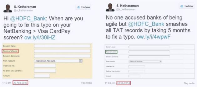
As a result, banking apps tend to undergo rigorous testing, which elongates release cycles. Ergo, banks will inevitably take more time to make a given UX improvement than fintechs. You can find an egregious example of that tendency in the following exhibit where a bank took five months to fix a typo!
#4. CAPACITY FOR ABSORBING LOSSES
Fintechs are under no pressure to post profits. They don’t have to lose sleep over high employee costs. This gives them the ability to pay outsized salaries to UX designers (among people in other roles). As long as they’re able to attract venture capital to fund their whopping losses, fintechs can splurge on high caliber designers at hefty pay packages and pamper them with beanbags, sleeping pods, and ESOPs.
Banks can’t do that. Their revenues and profits are under constant scrutiny by Wall Street and Dalal Street. Alarm bells will ring if banks post less than their customary high profits. All hell will break loose if they make losses.
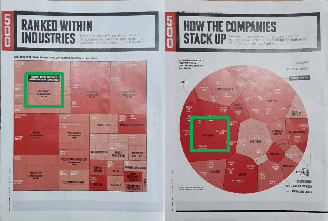
FINANCIALS is #1 sector in latest FORTUNE 500 by Revenues, Profits & # of Companies.
This drastically crimps banks’ ability to attract high caliber designers (and other roles).
#5. LEGACY?
In the West, banks began their computerization journey on mainframes 50-60 years ago. Over time, they embraced open systems and digital technologies. As a result, the typical IT landscape of most banks in the West is dotted with legacy and modern applications. A typical customer journey straddles both eras of applications. It’s not easy to make them work together that seamlessly. Many pundits hold that integration challenges take a toll on the UX of banking apps compared to fintech apps, which are built from the ground-up entirely on digital technologies.
I’m not too sold on this narrative because banks in emerging markets like India began computerization more recently and don’t have any legacy applications, but still lag fintechs on UX. Nevertheless I thought of bringing this point up for the sake of completeness.
Per anecdata, there’s no argument that bank apps have inferior UX compared to fintech apps.
That said, bank apps are vastly superior to apps from most other industries.
- For nearly 25 years, I’ve been using IBM / Lenovo ThinkPad laptops. Not once have I been able to order them from IBM / Lenovo’s website, which sucks bigtime. Ditto smartphone, hotel room, food from restaurant, etc.
Hotels keep ranting against the 15% fee but they don't do anything about holding on to visitors and making them book on their websites / apps.
I can't think of the last time I bought a laptop, mobile phone, hotel room, food, air ticket, etc. on the respective merchant's site.— Ketharaman Swaminathan (@s_ketharaman) October 25, 2021
- Every time I use my TELCOs’ websites or apps, I thank the almighty that it worked. The “thanksgiving” happens only half the time. Let me take the example of my broadband provider. Whenever I bust its daily data quota, I receive an email and SMS from the TELCO with a link to topup my plan in order to continue enjoying high speed. It’s always a guessing game what happens when I click the link: Sometimes, I’m taken to a landing page with my number prefilled and I can complete the topup in a couple of clicks; at other times, I reach the homepage where I need to enter the number; and some other times, nothing happens.
- Then there are a number of industries that don’t even have apps to be compared with banks. I can’t buy a Dove soap on Unilever’s website; Gillette razor blades on P&G website; or Listerine mouth wash on J&J website. At the dawn of Internet 20-25 years ago, the digerati predicted that Internet would kill the middleman. In practice, it has done no such thing. If anything, Internet has created some of the most powerful middlemen of all times. Ironically, I regularly buy the aforementioned FMCG products from the website of World’s Largest Middleman called Amazon. Feel free to correct me but I don’t know a single FMCG company that lets me order its products on its website / mobile app.
Thing is, I already topped up my account yesterday and Jio shouldn't have sent even a single alert. If this is the state of systems & CX in the TELCO that disrupted the other TELCOs, I won't hold my breath that TELECOM will make a dent on BANKING anytime soon. (2/2)
— Ketharaman Swaminathan (@s_ketharaman) April 26, 2019
But coming back to fintechs, the glass ceiling faced by banks won’t go away anytime soon.
Therefore, for the forseeable future, banks will lag fintechs on User Experience.
UPDATE DATED 12 JANUARY 2024:
During the four years since the original post was published, the media and some industry insiders have conflated it with “fincumbent” and “financial technology”. McKinsey largely reinforces our original definition in its recent article titled “Fintechs: A new paradigm of growth“.
What are fintechs?We define fintech players as start-ups and growth companies that rely primarily on technology to conduct fundamental functions provided by financial services, thereby affecting how users store, save, borrow, invest, move, pay, and protect money e.g. daily banking; lending; wealth management; payments; investment banking and capital markets; small and medium-size enterprise (SME) and corporate services; operations; and infrastructure (including embedded finance, and banking as a service). Excludes cryptocurrency, decentralized finance, and insurtech.
Once again, fintech is a vertical, not a horizontal.


