This is a slightly edited version of my answer to the following Quora question:
Usually, there are many apps in the market, the developer remains blissfully unaware of them, develops a similar app without being cognizant of the other apps, and then wonders what went wrong.
Yours is the right question. It’s a pleasure answering it even though I’ve not been A2A.
A quick glance at the other answers reveals a broad consensus: Citing the example of Google, Excel, et al, most people seem to be saying, yes, you should go ahead and build your app / product provided it’s better than the incumbents. I agree with the consensus opinion.
https://twitter.com/mdudas/status/1492651337581957121
I’ve highlighted part of the above sentence for a good reason. Just because a product came later doesn’t mean it will win – it has to be distinctly better than the incumbents. Testimony:
- While Google came late, no search engine that came later has managed to upstage it even after 20 years.
- Excel was not the world’s first spreadsheet but it hasn’t been dislodged from its #1 spot even three decades after it was launched by Microsoft in circa 1990.
This shows that building a product that’s better than the incumbents is not that easy or commonplace.
The goal of this blog post is to examine this challenge in greater depth and throw more light on the following two facets of “doing better”:
- How much better?
- How to make a new product to be that much better?
To dive deep into this challenge and answer the first question, let me reference the Harvard Business Review classic Eager Sellers and Stony Buyers: Understanding the Psychology of New-Product Adoption.
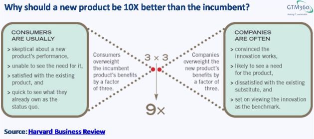
According to its author John T. Gourville, consumers overvalue benefits of incumbent products by factor of 3; and founders of new companies / products overvalue benefits of innovations by factor of 3. Their reasons for doing so are outlined in the following exhibit.
This causes a mismatch of 9X ~ 10.
Ergo, new product must be 10X better than existing product to succeed.
Let’s come to the next question of how to build a new product to be that much better than incumbents.
At the outset, doing better has more to do with consumer behavior – most specifically, the psychology of behavior change – than innovation or technology. Product developers should pay close attention to the following observation made by Gourville in the aforementioned essay:
Businesses spend billions of dollars making better “mousetraps” only to find consumers roundly rejecting them. Studies show that new products fail at the stunning rate of between 40% and 90%, depending on the category, and the odds haven’t changed much in the past 25 years. In the U.S. packaged goods industry, for instance, companies introduce 30,000 products every year, but 70% to 90% of them don’t stay on store shelves for more than 12 months. Most innovative products—those that create new product categories or revolutionize old ones—are also unsuccessful.
Gourville gives several examples of new products that have crossed the “10X better” bar and explains how they’ve done it.
Instead of repeating from the article, I’ll share my personal experience of a 10X better product: PayTM.
A senior leader of PayTM recently said that PayTM was the 48th digital wallet in India. I don’t know about the 48 figure but I know for a fact that there were many digital wallets before PayTM. I’ve tried a couple of them myself: One was during the feature phone era in the mid 2000s. I forget this product’s name and I haven’t heard about it in over a decade. Another was Vodafone M-PESA, which I gave up on because of a disastrous onboarding experience that I highlighted in my blog post entitled Omnichannel Fiasco #2: M-PESA at the time.
Like M-PESA, MobiKwik, et al, PayTM is a Prepaid Wallet. Like all prepaid wallets, it expects you to load money into it first before letting you make payments with it. Now, for a lot of people – including me – the need to preload money is a big friction hotspot for more than one reason.
For one, over time, your money is lying around all over the place and you lose track. That sucks.
For another, when you attempt to pay a bill without realizing that your wallet doesn’t have enough balance to cover the bill, your payment fails: All digital wallets I’ve used kick you out with an error message telling you to first preload enough funds to your wallet and then come back and retry your payment. That sucks even more.
PayTM does it differently.
If your wallet balance is too low to cover your payment, PayTM automatically gets you to fund the shortfall by taking you to your funding source – credit card on file or UPI or whatever – and completes your payment in a single pass. You don’t get any error messages. Instead, you get a reassuring confirmation that everything is going smoothly.
This is great UX.
But that’s not the only feature on which PayTM is superior to other digital wallets.
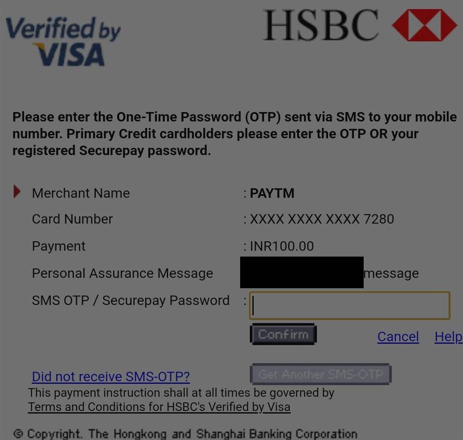
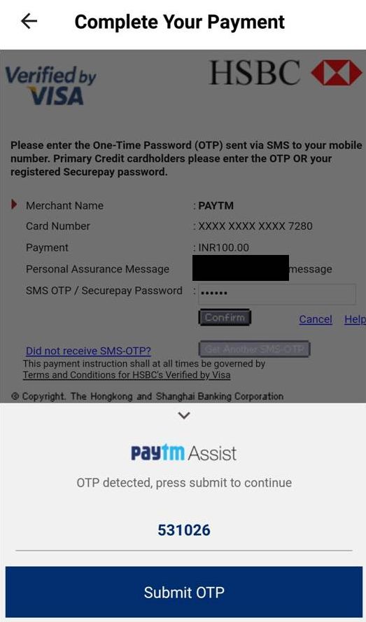
Let me take the following 2FA / 3DS screen on which you authorize an online credit card payment on any merchant’s website.
This is one of the worst-designed screens I’ve ever come across anywhere. It’s quite painful to enter the OTP / VbV / MSC inside the tiny field, especially on a mobile device. Sometimes, when I try to tap the small Confirm button to complete the payment, I end up hitting the Get another SMS-OTP button just below it by mistake.
But there’s no respite from this screen (other than to avoid digital payments altogether) – most merchants / digital wallets shrug their shoulders and say “this screen belongs to banks, we can’t do anything about it”.
But PayTM doesn’t say that.
Instead, it has developed a feature called PayTM Assist. Appearing as an overlay on top of the original screen, PayTM Assist automatically detects the OTP from the incoming SMS message and enters it into the required field on the original form. You’re saved the trouble of dealing with the original screen.
PayTM Assist not only provides great UX but alleviates the friction caused by somebody else. On a side note, I’m seeing this feature being copied by a few other apps e.g. Dunzo, Ola (but not Uber).
As a result of the above features supported by PayTM, I find it “10X better” than other digital wallets.
With one exception: HDFC Bank PayZapp.
PayZapp is not a prepaid wallet. It allows payments to be made directly from the credit card. As I highlighted in HDFC Bank’s PayZapp Ends My Bill Payment Woes, PayZapp stores my credit card on the mobile device and accordingly supports 1-Tap payment. By eliminating the need to preload the wallet and enter OTP / VbV / MSC, PayZapp is even more frictionless than PayTM. Accordingly, PayZapp has become my go to mobile wallet app. However, PayZapp doesn’t support payments to Uber and my energy utility among other merchants that PayTM does. So, there are a few payments I still make with PayTM. (UPDATE DATED 7 NOVEMBER 2018: Uber accepts credit card now and has implemented an innovative and relatively frictionless way of 2FA, so I’ve deleted PayTM and added my credit cards as funding sources for Uber; PayZapp now supports payments to my energy utility.)
Lest this post be misconstrued as an unqualifed endorsement of PayTM, I must hasten to direct readers to my blog post entitled PayTM Decimates Trust With A Single #FeatureOrBug, where I’ve outed a shady practice followed by PayTM recently. Ergo, I use PayTM only to avail myself of its #VCSubsidy.
That said, PayTM’s recent shenanigans don’t take away from the ~10X superiority of its product over other digital wallets (barring PayZapp).
 The term “better than other products” is subjective to a certain extent. The “10X better” tag is even more subjective.
But, from personal experience, anecdotal evidence and research, I’m convinced that it’s possible to build a new product that’s substantially better than the incumbents.
As we’ve seen in the case of PayTM, UX is one area for improvement.
But it’s not the only one.
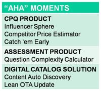
As you can see in Who The Heck Outsources Product Management?, we’ve helped product developers make significant improvements to their products by way of core functional enhancements and aha moments.
Then there’s always the “BSB Design Principle”:)
“10X better” can be achieved with a couple of major (“5X”) improvements or with four to five minor (“2X”) improvements.
If you wish to make your product 10X better, we can help.


Play onto a website that provides an excellent benefit
if you desire less share game than seeking on rake backs.