In Four Out Of Five Brands Get PUSH Notification Wrong, I shared my experience with PUSH notifications from four leading brands. I found it impossible or very cumbersome to redeem the targeted offers made by them.
At the end of the post, I promised to share the rare example of a brand that gets PUSH notifications right. To recap, getting PUSH right means, when you tap a PUSH notification, it opens the app that sent the notification and takes you directly to the section on the app that is referenced by the PUSH (and not the app’s splash screen).
That brand is PayTM.
Here’s my experience with PayTM’s PUSH notifications.
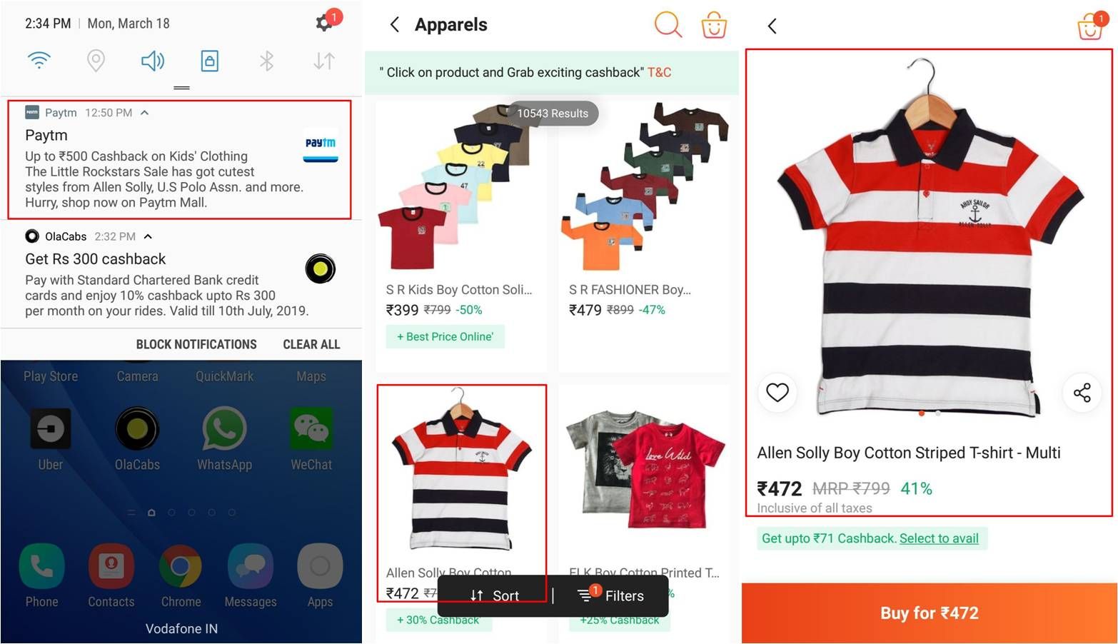
- The targeted offer for cashback on apparel purchase looked like any other PUSH notification. But where it differed from PUSH notifs of other brands was that it was fully joined up end-to-end, right from the Notification Bar through to the Landing Page and Checkout. (Had I hit the buy button on the last screen, I’m sure the promised cashback would’ve been applied to my order.)
- PayTM also has another type of PUSH notification that’s novel and unlike the ones I’ve seen from any other brand. It looks like a docking station and has multiple CTAs on a single notification e.g. Pay / Scan, Mobile Recharge, etc.
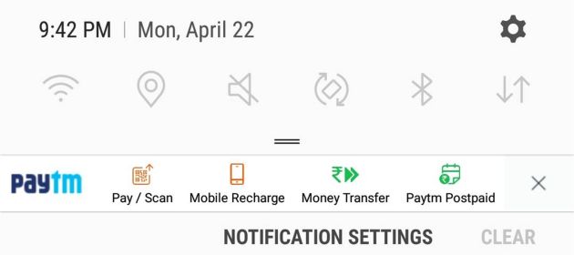
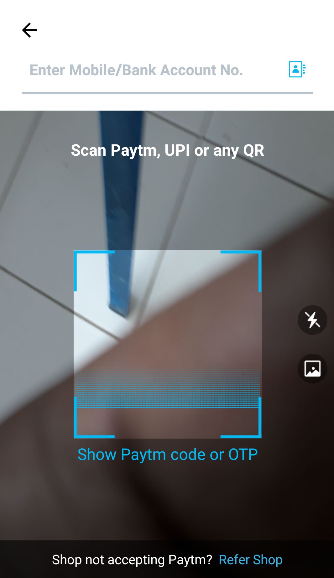
- Tapping a certain CTA took me directly to the app’s screen for that specific category. Unlike other brands, I wasn’t stranded on the app splash screen and left to my own devices. For example, when I tapped Pay / Scan on the PUSH notification, I directly reached the wallet’s P2P / P2B payment screen.
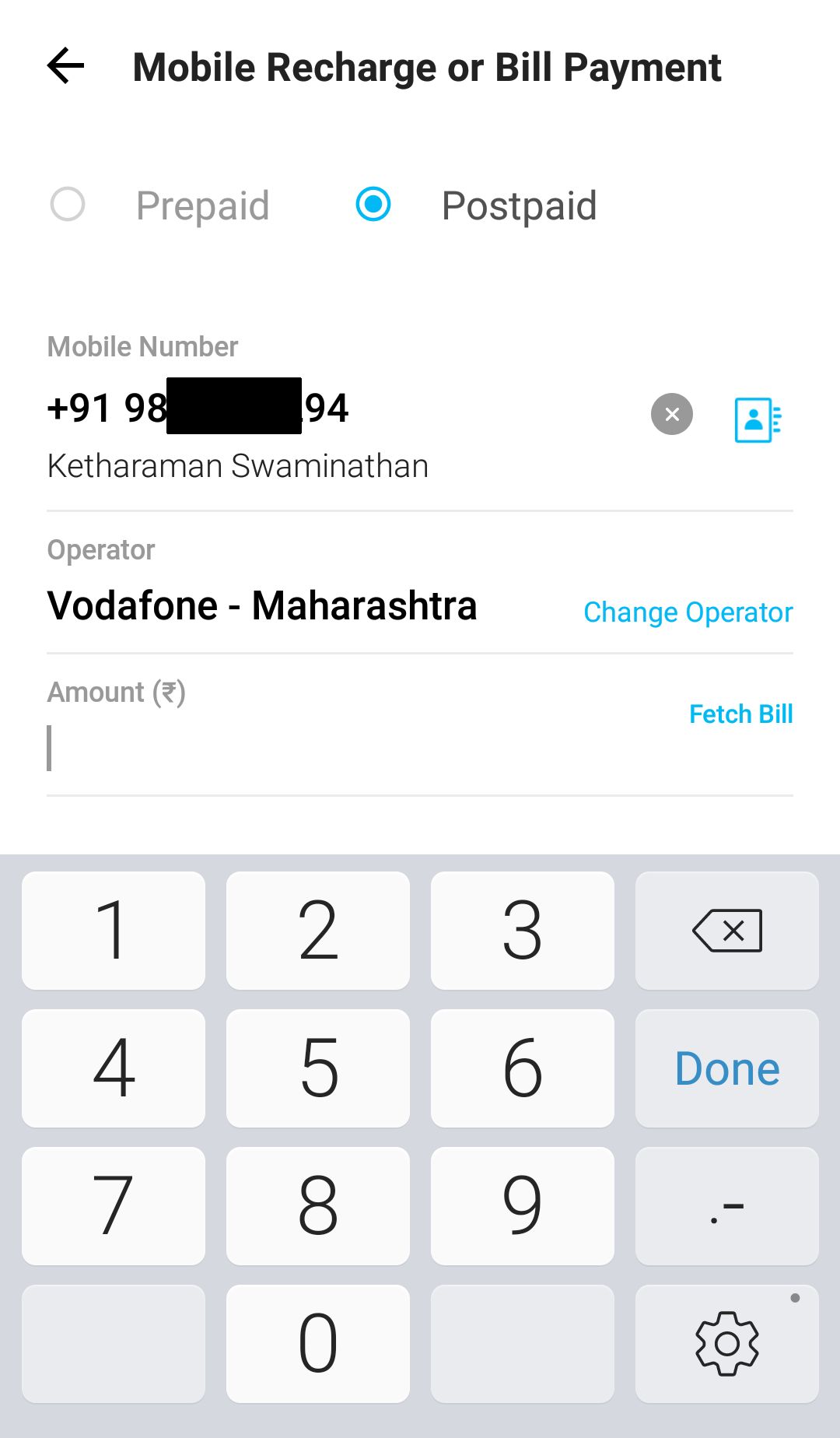
- After reaching a certain category, I saw a form that was prefilled with details of my last transaction under that category. For example, when I tapped Mobile Recharge on the above PUSH notification, I reached the following in-app screen where all I had to do was enter the amount and readily pay my mobile phone bill.
- Tapping the PUSH notification did not remove it. It stayed on the Notification Bar even after I hit CLEAR ALL. This is the only PUSH notif I’ve seen that survives the global Android notification kill command. The only way to remove the PUSH notification panel is to tap the ‘X’ mark on the extreme right of the PUSH panel. I don’t know about others but this is exactly how I want my notifications to be – hanging around until I shoo them away.
As you can see, I was in a position to redeem every targeted offer made by PayTM’s PUSH notification.
By working as advertised, PayTM’s PUSH notification helped drive repeat sales and probably achieve a few more CEM goals.
Ergo, I tend to believe that PayTM has mastered PUSH notification.
I’m also quite sure this is one more reason why PayTM is miles ahead of its competition.
