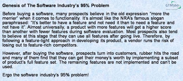
In The IT Industry’s 95% Problem, Gartner Research VP Brian Prentice notes that an average user of a software uses only 5% of the product’s features. In other words, 95% of the features in a software create no value for the overall customer audience. While you could quibble about the exact percentages, no one will deny that a bulk of functionality of most software goes unused.
Unfortunately, this five percent varies from user to user and from one industry to another, so it’s impossible to find the 95% and just remove it.
Besides, the 95% is there for a good reason.

As veteran product and marketing managers know, software is an aspirational purchase. Customers don’t buy new software for slight improvements over their status quo. They buy it only if the software supports enough “best practices” to take their companies to the “next level”. Features that are appealing before the sale are not always implemented after the sale.
Therefore, a certain degree of “bloat” – or excessive features – is inevitable in software.
We predicted that this would change in SAAS software for reasons explained in SaaS Will Change The Outcome Of The Bloatware Versus Light Apps Debate but, four years after that post was published, not much has changed. Even SAAS software has a lot of bloatware. Testimony: Bloomberg terminal.
The Bloomberg terminal proves that bloatware works even in SaaS – as long as it's obfuscated by a cool UI. http://t.co/TYM6XF73PW
— GTM360 (@GTM360) January 29, 2014
Prentice says that there’s a serious product management problem if “a piece of software doesn’t have a majority of its capabilities being used by most of its users”.
We agree. If users don’t use a bulk of the software’s feature set, they might feel that they’re wasting the software and cancel their subscriptions. Therefore, the 95% problem could cause churn.
How do we solve this problem?
Prentice recommends creating multiple products for different target markets. He takes the example of Mariner Software to illustrate this approach:
Mariner Software makes, amongst other things, word processors. Notice the use of the plural. They have a word processor specific for the needs of screenwriters (Montage). They have a word processor for novelists (StoryMill). They have a word processor for journalist/bloggers (MacJournal). And they have a bare bones word processor that gets the main typed stuff done that most people at home, or school, contend with (Write).
I agree that this approach will solve the basic problem. But it will introduce the following challenges:
- High cost of developing and maintaining multiple codebases, one for each target market segment
- Manifold increase in marketing costs due to multiplicity of products and their associated paraphernalia such as microsites, datasheets, brochures, canned demos, marketing campaigns, and so on.
These challenges can be surmounted if this approach will expand the market, and revenues therefrom. But it’s unlikely to do that. If you look at Mariner Software’s approach carefully, the firm is breaking up the market for word processor into multiple segments instead of expanding it. Therefore, it’s debatable whether its approach to product management would be sustainable. Since Mariner Software is a privately-held company, we don’t have enough data about its financials to make a calculated guess.
We propose an alternative approach to solving the 95% problem: Leave the core software software unchanged. Recast its frontend in the following manner for the (say) two target industries, Manufacturing and Retail:
- Change screen literals to match the lingo of the respective target industry e.g. The invoice screen should use the label “item label” for Manufacturing and “SKU” for Retail
- Build 25% of the menu items from the top 5 most used features of the software across all target industries
- Build 50% of the menu items from the top 5 most used features of the software within the specific target industry
- Build the balance 25% of the menu items from the top 5 most used features of the individual user
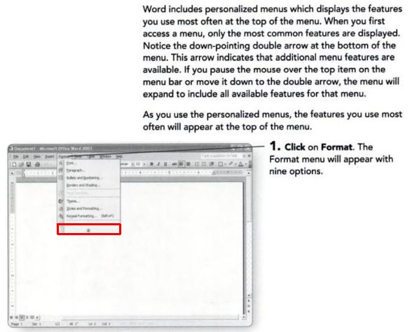
- Have a separate button that users can click to invoke the remaining features as and when they need them. This is like the double arrow appearing on the bottom of some Microsoft Office menus, as shown in the exhibit on the right.
This approach will result in multiple frontend versions, each providing the best UI for its respective target segment compared to the bloated monolithic UI of the core product. For that reason, we’ll call this approach Multiply UI.
By its very design, Multiply UI delivers lighter frontends and camouflages bloat. By exposing users only to the functionality regularly accessed by them, Multiply UI assures them that they’re getting full value from their software, thereby encouraging their employers to renew their subscriptions. Multiply UI achieves these feats with a single codebase for the entire market.
Churn caused by 95% problem solved! That too, without breaking the bank!! Hail Multiply UI!!!


