One perennial question that startups – and even product managers of established companies – ask us while designing a new product is whether they should ask customers what they want.
Our standard answer is NO!
Only a services company asks customers what they want.
When a product company does that, it can prove counterproductive – or even dangerous at times – for several reasons:
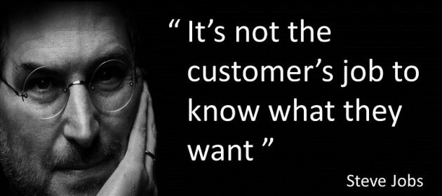
- I’m not a Fanboy but I agree with Steve Jobs: “It’s not the customer’s job to know what they want”
- Your customers will like or dislike what you give them but they won’t be able to tell you that they want it before getting it. As Henry Ford famously said, “If I had asked people what they wanted, they would have said faster horses.” (rather than automobiles)
- Before the fact, no user will express an interest in ERP, CRM, SRM and other so-called “second order software products” that replace financial accounting, contact management, vendor management and other “point solutions”
- In high-end enterprise applications, there are times when you’ll need to tell the customer what they should be doing. If you blindly accept what they tell you, the project can go for a big toss, as described in When ERP Projects Get Derailed By “Silly” Reasons. Obviously, you can’t pull off the “tell” strategy if you’ve asked that customer what they want.
Building what customers want is services mindset. In products, founding team must be able to build v1.0 w/o talking to customers. Else it should stay away from product business. Customer feedback okay to go from n to n+1 but commercial challenges crop up. https://t.co/XOlIv6CcPg
— Ketharaman Swaminathan (@s_ketharaman) May 27, 2020
If you shouldn’t ask what customers want, how do you design a product that the same customers are expected to use?
You get inputs from analysts, competitors and other sources to divine what customers like (and don’t like); observe live customer situations; and envision the limits of what is possible, and build your product accordingly. In addition, if your product falls under a crowded category, you need to make your product 10X better than incumbents by creating AHA moments.
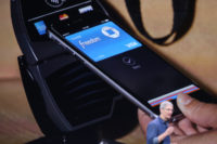
Apple Pay follows that playbook perfectly.
For the uninitiated, Apple Pay is a mobile wallet that lets customers make digital payments instore and online. You can find more about Apple Pay in my blog post entitled Apple Pay Puts Banks Squarely At The Center Of Mobile Payments.
Like most Apple products, Apple Pay was not the first in its category. Before it entered the scene in 2014, this is how mobile wallets worked:
Reach checkout; take out smartphone; enter lockscreen password; reach homescreen; locate mobile wallet app; find the card you wish to use; tap POS terminal; enter password.
While this sounds fine on paper, mobile payments bombed in real life for several reasons:
- There’s a lot of friction in locating the one mobile wallet app from among the scores of other apps installed in the smartphone
- It’s not easy to find the specific card with which you want to pay at a given store (think Card A for business expenses and Card B for personal expenses)
- You’d slow up the queue and invite dirty looks from people behind you while doing the above
- Patchy network connection will scupper the whole process.
 As a result, mobile wallets struggled to gain traction.
Enter Apple Pay.
In sharp contrast to the incumbent mobile wallets, Apple Pay automates these steps.
There’s no need to open the lockscreen. Apple Pay fires itself up and keeps the appropriate card ready when you reach the checkout. Just tap and go. There’s no need for network connection or GPS at the Point of Sale.
In this manner, Apple Pay solved many of the hurdles that come in the way of mainstream adoption of mobile payments. I’m sure it will beat the incumbent mobile wallets in short order. (It did: By 2020, Apple Pay acquired 97% market share of contactless mobile payments in USA.)
According to Benedict Evans of a16z, iPhone did the same in smartphones. In How to lose a monopoly, he argues that smartphones from Microsoft, Blackberry, Nokia and Palm were based on the constraints of 2000 whereas iPhone was designed for what would be possible in 2010.
I know that’s Apple. If you’re thinking everyone can’t be like Apple, you’re right.
But it’s not only Apple.
Let me give you a few more examples.
 SalezShark: India’s IT industry association NASSCOM recently selected this relatively unknown SAAS solution to power its sales operations. Its founders attribute this prestigious win to going beyond their established rivals to offer Relationship Intelligence and Recommendation Engine. According to the NASSCOM executive quoted in SalezShark to handle Nasscom sales operations, these two modules were “not offered by any other product”.
CPQ: Our services-to-product turned customer entered the Configure-Price-Quote space when it was already quite crowded. To outflank incumbent CPQ vendors, it envisioned the limits of what was possible in the new social selling era and accordingly created many AHA moments in its product. More at Latecomer Outflanks Incumbent Products.
Whether it’s the powerhouse Apple or newbie SalezShark or our services-to-product turned CPQ customer, envisioning the full potential of what is possible and developing a product to achieve that potential is key to creating pathbreaking products.
That can’t happen by asking customers what they want.
While this blog post is centered around new products, its central theme is equally applicable for upgrades to existing products – although the challenge is more commercial in that case.
UPDATE-1:
What about making UI / UX / functional changes to existing products?
This LinkedIn Post suggests that you should ask customers.
When you are redesigning your product/ platformWhen a user triggers an existing workflow:
the user if she wants to try a new way or better way, or 2x faster way to do the same thing ( Depends on what the design has fixed) ..
2. If the user doesnt opt for it, its not broken, dont change it. If she opts for it and is able to complete the task, take a feedback.. If its great and statistically most users are loving the new way, baseline and roll it out. Else go back to design board.
introducing all redesigned elements like this..
Let the users feel in control of the system, they are driving the platform to better design..
Let not the change be abrupt and at one go..
This method can make the Change management highly effective and acceptable unlike new major releases which put off people ( Example Windows 7 tiled layout or Quora spaces)
I agree with the “ASK” approach if it’s a service / custom solution.
If it’s a product, I recommend the “TELL” approach in line with the original post. So, my recommendation is as follows:
Asking users what they want is passé. I favor observing what users like instead. For over 10 years, A/B testing has been the best practice for deciding changes to existing software. Use it. Don’t ask.


