With so much buzz around Content Marketing, content deluge is the new “information overload”. From “helpful” guides to outright sales pitches to several things in between, I get hit by around 100 pieces of content every day. I’m sure your day is no different.
Each of us has our own way to manage the deluge.
@rshevlin I use the 1×3 policy. Read 1 screenful of tweets. Swipe past 3 screens of tweets.
— GTM360 (@GTM360) January 7, 2015
If you’re still looking for a “structured and repeatable way” of tackling your content deluge, welcome to my
6 x 3 Rule for Surviving Content Deluge.
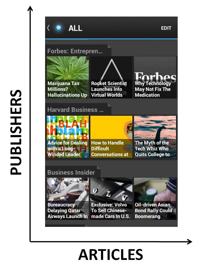
I’ve devised this rule for LinkedIn Pulse, which is my go to reader app for consuming content. Pulse users would be aware that the app organizes organizes content in the form of a grid on its splash screen: Publishers (e.g. Harvard Business Review) are stacked vertically from top to bottom in the order I’ve added them when I set up the app. Articles (e.g. “The Myth of the Tech Whiz Who Quits College To Start a Company”) are laid out as square buttons horizontally from left (latest) to right (older) .

As soon as I open Pulse, the app automatically refreshes its splash screen with the latest articles from the publishers in my list.
The 6 x 3 Rule kicks in at this point.
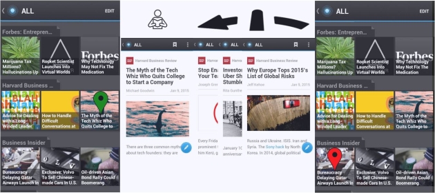
I start from the first publisher on the top and scan the title of each article. On my smartphone screen, I get to see three articles horizontally. If I don’t like any of them, I swipe the screen to the left to see the titles of the next three articles. If I still don’t like any of them, I skip to the next publication below. In short, https://somabest.com without leaving the splash screen, I’ve scanned the titles of six articles of a given publisher. Hence the 6 part of the 6 x 3 rule.
If I’m interested in reading an article after seeing its title, I tap its button. This takes me to another screen. After reading the article, I swipe the screen to the left to see the next article (It’s not necessary to go back to the splash screen to view the next article.)
If I like it, I read it. If not, I swipe to the next article. I repeat this process until I swipe past three consecutive articles without reading them, at which stage I return to the splash screen and check out the next publisher’s feed below. Hence the 3 part of the 6 x 3 rule.
By this time, I’ve executed the 6 x 3 rule for one publisher.

I then repeat the aforementioned steps for the next publisher until I reach the last publisher on my list.
With that, I’ve executed the 6 x 3 rule completely. It takes me typically 40-50 minutes per day.
There are days when articles I select happen to be particularly long. On those days, I simply switch to a 4 x 2 variant. Barring those rare occasions, the 6 x 3 rule does a good job of controlling the time spent on content.
PS: While the 6 x 3 rule works on Pulse, it shouldn’t be difficult to devise similar rules for FlipBoard, Zite, News in Shorts and other popular reader apps since they all follow a two-dimensional grid layout of some kind.


