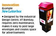
 A recent Economic Times article titled India Inc’s Design Deficit lists a few examples of innovative design to have emerged from India in recent times. While it admits to the relative paucity of success stories in this department, the article claims that India’s design deficit owes itself to a shortage of funding rather than lack of imagination. I beg to differ.
While I wasn’t personally impressed by any of the examples, it was the New Letterbox from the Industrial Design Center (IDC) of my alma mater IIT Bombay that really got my goat. Here’s why:
Over 30 years ago, the joining batch of B.Tech students – which included me – was taken around on a trip to all departments in IITB as a part of the induction program conducted on our first day in campus. At IDC, the professors showed us a slew of products designed by their department and gave the pride of place to – ahem – a new letterbox! At the time, the standard letterbox in India was cylindrical and rectangular designs were just entering the scene. The rectangular variant featured a flat top that allowed people to write the address on the postcard or envelope before dropping them into the letterbox. In the then prevailing design, the flat top sloped from top to bottom on the front. As a result, if one person was using it to write the address, s/he would block the slit, so the person at the back would have to wait until the person ahead of them moved out before they could drop their letter into the letterbox. In contrast, the IDC-designed letterbox featured a flat top that sloped the other way. As the address-writer was standing at the back doing their thing, the letter dropper could concurrently access the slit at the front and finish their thing. The denizens of IDC were very proud that they’d done their own bit to push the needle on ‘multitasking’, which was the buzzword those days. I suspect that not many of us in attendance were convinced that this was a great sign of innovation. But, because that was our first day away from home for most of us, we were perhaps too nervous to contradict the IDC faculty.
 Cue to 2012. The new letterbox design from IDC continues to be rectangular. Apart from using plastic instead of metal and looking a little sleeker – reminds me of an ink cartridge for some reason – it looks and works exactly like its predecessor did 32 years ago. The design was not greatly innovative then, it’s certainly not innovative now. In fact, by selecting an item like a letterbox that’s virtually rendered obsolete by email and social media in this day and age, IDC shows severe lack of imagination. By removing economic constraints, only more money would’ve gone down the drain on such design projects.
It’s not as though there’re no examples of good design from Indian businesses. I personally love the container of Gowardhan Ghee. For the uninitiated, ghee, a Sanskrit word, “is a class of clarified butter that originated in South Asia and is commonly used in South Asian (Indian, Bangladeshi, Nepali and Pakistani) cuisine and ritual” (Source: Wikipedia). In India, mothers tend to stuff their kids with ghee to make them look chubby. Have one look at the oblong jar on the left. I think it perfectly conveys the product’s function and promise, which is the hallmark of great design. Tell me if you disagree.