Beneath their hoods, software applications and websites may be all science but there’s a lot of art on their surface. There’s no right answer when it comes to screen layout, color schemes, navigation flows and other design elements. While one designer might prefer an orange button over a black background, another would swear by a white background and blue button. Some etailers might be satisfied with basic credit card validation, fearing that CVV, VbV and other stronger authentication methods might turn off an average online shopper whereas others might want to minimize their fraud risk and let the shopper be ferried around by electronic payment gateways across third-party websites before bringing them back to their own website to issue the order confirmation.
Traditionally, gut feeling has played a strong role in deciding what option to choose when it comes to the aforementioned design elements.
However, website owners, etailers and designers are aware that even small changes in design could have a major impact on the conversion of browsers to buyers, so they’re forever looking for scientific techniques to help them with their decision making instead of leaving it totally to their gut. Traditionally, they’ve relied on surveys and focus groups. However, in today’s world, such techniques are not really adequate. Witness, for example, the fate of BORDERS and Barnes & Noble who continue to close stores across the nation even as they managed to take the top two spots in Forrester’s annual Customer Experience Index that is based on surveys.
What if designers had a way to test their alternative designs using live traffic instead of relying on the verdict of a bunch of community testers?
With online A/B testing, they do. Designers select one or more conversion actions on a given web page and model two versions of that page. They split their live traffic into two parts and route one through version 1 and the other, through version 2. By measuring the conversion metrics on each version of the page, they can scientifically conclude which version fares better.
In the above illustration, a click on the “Sign up!” button by a website visitor would be an important conversion action. The two versions of the webpage are Design A and Design B which have different background and button color as shown in the above diagram. If an A/B testing indicates that (say) Design B converts better – that is, has a higher percentage of visitors who clicked the “Sign up!” button – the designer would be in a position to scientifically decide that Design B is the way to go and ditch Design A.
While A/B testing as a statistical tool has been around for a long time, its use in software design has been restricted. Despite early adoption from the likes of Amazon, A/B testing never went past the realm of the big e-commerce players. The reason isn’t hard to figure: While designing an A/B test and developing multiple versions of a page (or sets of pages) are quite simple, executing the test demands close coordination between the designer and the hosting provider in order to activate the right version of the page at the right time, manually record traffic and conversion for each version, and jump a few more hoops.
Google tried to mitigate some of the pain involved in executing A/B testing with its Google Website Optimizer launched a few years ago. However, according to anecdotal evidence, GWO didn’t go far enough and A/B testing remained too difficult for the average website owner.
No longer.
![]() A new crop of cloud-based solutions from Optimizely and a couple of other companies makes A/B testing easy. These companies do all the heavy lifting on the cloud and free up designers to focus on the business side of optimizing their pages.
A new crop of cloud-based solutions from Optimizely and a couple of other companies makes A/B testing easy. These companies do all the heavy lifting on the cloud and free up designers to focus on the business side of optimizing their pages.

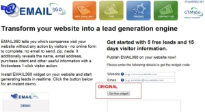
We recently wanted to carry out an A/B test to figure out the best possible button text and color for the “Get this widget” button on the home page of our EMAIL360 website.
At about this time, we’d read about Wingify / VisualWebsiteOptimizer in a local newspaper, and signed up with it. Unfortunately, VWO couldn’t track even elementary conversion actions like a button click. As a result, we decided to abandon it. We got an email from its founder a day later. Although we’d set up our experiment on Wingify’s website, its founder’s email showed no prior knowledge of what we’d attempted to do, and why we failed. We replied back asking them to review our experiment and tell us how to proceed. Instead, their response was, like, duh. This send major alarm bells ringing in our mind. Since we knew the basics of A/B testing, we weren’t sure how Wingify would handle more complicated questions that would inevitably crop up as we went deeper into the execution of our experiment and decided to stop dealing with it.
We then decided to check out Optimizely, a startup we were quite impressed with when we’d read about its launch around a year ago. Thank goodness we did that. Whatever our experiment needed, we found them easily on Optimizely. Its founder, Dan Siroker, himself stepped in with help at crucial times. It was commendable that a person of his pedigree – Director Analytics for Obama Campaign and Google Chrome Product Manager – was personally involved during the whole process, “getting” our questions immediately and reverting back with crystal clear, actionable responses within reasonable time.
In Part-2 of this post, we’ll share the findings of the A/B testing done on the EMAIL360 website using Optimizely (Spoiler Alert: We learned that the original design had a lot of scope for improvement!). Stay tuned.

Pingback: Art Meets Science With A/B Testing – Part 2 « Talk of Many Things